https://eos.org/features/visualizing-science-how-color-determines-what-we-see
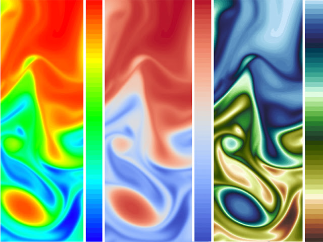
Scientists use data visualization to quantify, interpret, evaluate, and communicate information. Recent research into the ways that people see and interpret colors is improving tools to convey visual data clearly and accurately. This image shows a comparison of the same data set displayed using the traditional rainbow colormap (left), a cool–warm colormap (middle), and a “wave” colormap, illustrating how visible detail can change when data are portrayed with different color gradients.
Credit: Graphic created by Francesca Samsel with data processed and provided by M. Petersen, Los Alamos National Laboratory (LANL), using MPAS-Ocean
Color strongly influences the way we perceive information, especially when that information is dense, multidimensional, and nuanced—as is often the case in scientific data sets. Choosing colors to visually represent data can thus be hugely important in interpreting and presenting scientific results accurately and effectively.
“Language is inherently biased, but through visualization, we can let the data speak for [themselves],” said Phillip Wolfram, an Earth system modeler and computational fluid dynamicist at Los Alamos National Laboratory. At Los Alamos, data visualizations are as ubiquitous as the sagebrush that embroiders the nearby desert. Every day, expert teams wrangle, render, and color encode swaths of data for interpretation with the lab’s Earth and computer scientists. Choosing colors to represent various properties of the data, a step that ranges from an iterative, responsive process to a hasty afterthought, is the final barrier between painstaking data collection and well-anticipated analysis and discovery.
“The same colormap applied to a diverse array of data gets monotonous and confusing.”Most visualization software comes equipped with colormaps—a selection of standard color-encoding gradients that researchers can, in a matter of seconds, apply to display and evaluate their data. But not all data visualizations are created equal, and despite a proliferation of literature denouncing standard maps like the traditional rainbow colormap [e.g., Borland and Taylor, 2007], they pervade visualizations from basic bar graphs to complex depictions of biogeochemical data.
At AGU’s Fall Meeting 2019 in San Francisco, Calif., this past December, row upon row of posters in the convention center’s vast main hall featured the same bright, standard colormaps adorning visualizations of temperature scales, chlorophyll concentrations, land elevations, and a host of other data.
“The same colormap applied to a diverse array of data gets monotonous and confusing,” said Rick Saltus, a senior research scientist with the Cooperative Institute for Research in Environmental Sciences (CIRES) at the University of Colorado Boulder. “You’re trying to communicate both effectively and efficiently, and that’s impeded if the viewer is presented with a variety of concepts, all illustrated using identical color mappings.”
Color researchers and visualization experts around the world are working to change this status quo. A number of groups are developing new tools to help scientists image increasingly complex data sets more accurately and intuitively, and with higher fidelity, using context as a guide to ensure an appropriate balance of hue, luminance, and saturation.
How We See Color
More than a century ago, Albert H. Munsell built upon the work of Isaac Newton and Johann Wolfgang von Goethe to compose our modern concept of color “mapping” [Munsell, 2015]. Munsell’s research produced the first perceptually ordered color space—a three-dimensional plot in which the axes represent hue (color), value (lightness or darkness), and chroma (intensity of color) [Moreland, 2016].
Around the same time, in the early 1900s, Hermann Grassmann’s theory of linear algebra decrypted abstract math, revealing the origami-like properties of higher dimensions. Grassmann thereby created the concept of vector space, allowing for the approximate calculation of perceived color within a defined area [Grassmann, 1844]. The study of color no longer depended on approximation, but could rather be coded numerically, plotted along a parabola. This level of accuracy is necessary because color perception is a subjective experience dependent on light, simultaneous contrast (the phenomenon of juxtaposed colors affecting each color’s appearance; see Figure 1), and rod and cone photoreceptors within the viewer’s eyes [Albers, 2006; Itten, 1970].
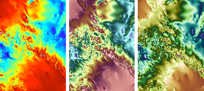
Fig. 1. Detail of topography between the Filchner-Ronne and Ross Ice Shelves in West Antarctica. This image illustrates the effects of simultaneous contrast within the traditional rainbow colormap (left), increased detail in a desaturated version of the traditional rainbow (center), and an analogous color palette for greater aesthetic quality as well as discriminatory power (right).
Credit: Graphic created by Francesca Samsel with data processed using E3SM
In the Eye of the Beholder
Contemporary “color spaces” (Figure 2) can be divided into two categories: absolute and nonabsolute. Absolute color spaces define color in terms of human perception. More familiar non absolute color spaces such as red–green–blue (RGB) and cyan–magenta–yellow–black (CMYK) define color based on self-contained models that rely on either input devices, like a camera, or output devices, like a monitor or printer.
The popular rainbow map was defined within a nonabsolute color space—its gradient spans many highly saturated hues without consideration for their mathematical separation within an absolute (perceptual) space. This arrangement creates extremely high contrast between hues, visually demarcating different values in a data set and thereby propelling the rainbow map to default status among most scientists.
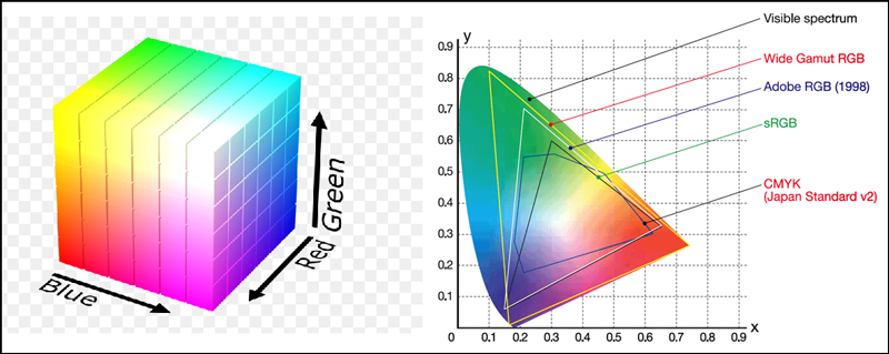
Fig. 2. Two types of color space established by the International Commission on Illumination (CIE) in 1931: the nonabsolute RGB color space illustrated using a cube (left), and the CIELAB color space (right), one of the most widely used absolute color spaces. The full parabola of CIELAB color space illustrates the full visible spectrum of hues typically discernable by the human eye. Within this parabola, the white triangle encloses all hues available in Adobe RGB color space. (CIELAB is a three-dimensional space shown in two dimensions here for simplicity.)
Balancing Familiarity with Clarity
Scientists and visualization professionals attempting to heed the latest color mapping research struggle to break away from standard, data-independent maps like the traditional rainbow, viridis, the cool–warm divergent, Jet, and Turbo (Google’s increasingly popular next-generation rainbow), however. Impeding its adoption are scarcities of convenient and user-friendly color mapping resources, of available expertise and guidance, of precedents within the community, and of time available to researchers to familiarize themselves with new color conventions [Moreland, 2016].
“When people approach a visualization, they have expectations of how visual features will map onto concepts,” said Karen Schloss, a psychologist at the University of Wisconsin–Madison and the Wisconsin Institute for Discovery. Schloss and her team are working to tackle these implementation issues and understand trade-offs between deeply ingrained, communal familiarity and the next generation of color tools.
“We refer to these expectations as inferred mappings,” she said. “If someone has been working in a particular field their whole [life], they have this inferred mapping for colors and the values they represent. We are trying to understand these biases while also being careful about recommending that these experts just abandon their conventions completely. We need to find a balance.”
In search of that balance, visualization experts are focusing their efforts on understanding what scientists need from their data and on how to address those needs without compromising the information contained in the data themselves.
What Do Scientists Need?
Francesca Samsel, a research scientist at the Texas Advanced Computing Center (TACC) at the University of Texas at Austin, and her team describe scientists’ needs with respect to data visualization using three categories—feature identification, exploration, and communication—as well as subcategories of pinpointing outliers and determining relationships. While interpreting a large data set, scientists are usually looking for specific features (e.g., the direction of flow of ocean currents or water temperatures in certain locations) within known data ranges; or they are exploring the data holistically to make general observations; or they are looking to communicate specific properties of the data to colleagues, peers, or the public. Occasionally, a researcher may be interested only in outliers, or in the way one variable affects another—for example, how does water temperature change when two currents meet?
Visualization is how scientists interact with the quantitative outcomes of their research and how they make data-based arguments, said Wolfram. He regularly uses visualizations, including overhead plots, representing the view from above (e.g., from satellites) to explore Earth systems and climate data in his work at Los Alamos. “What I’m looking for is tightly coupled to the science question,” he said. “I’m typically trying to understand geospatial relationships, particularly in overhead plot data, for surface features like [ocean] eddies.” Advanced color mapping tools help prevent significant losses of feature detail in the data Wolfram analyzes, unlike standard maps like Jet (Figure 3).
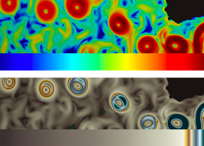
Fig. 3. Comparison of the same data portrayed with a desaturated rainbow colormap (top), which is often used to increase visual detail, and with a colormap designed to provide detail in outlying data ranges (bottom). The specialized colormap provides detailed information about the kinetic energy within eddies in the Agulhas Current, a major current in the Indian Ocean, whereas the rainbow colormap simply identifies the eddies.
Credit: Graphic created by Francesca Samsel with data processed and provided by M. Petersen, LANL, using MPAS-Ocean
Samsel and others argue that non-data-dependent color mapping strategies can in fact perpetuate bias if the hues are not arranged in a familiar order (e.g., rainbow order), if the luminance is not specifically accounted for, or if multiple gradients within a map are not arranged for a specific data set [Borland and Taylor, 2007]. The importance of visualization throughout the research process necessitates high-level tools that maximize information and minimize obstruction caused by any of these color-related issues. Researchers Samsel, Schloss, and Danielle Szafir, an assistant professor and director of the VisuaLab at the University of Colorado Boulder, have taken concrete steps to create such tools, maintaining the goal of intuitive operation.
A New Set of Color Tools
Samsel, who was trained and worked for 25 years as an artist before pivoting to visualization, uses her knowledge of color theory in tackling the perceptual challenges of crafting colormaps. “We’ve discovered in the course of our research that presenting scientists with perceptually equalized colormaps is not always the most beneficial solution” for providing the kind of resolution scientists need within their data, Samsel said. There are nuance and complexity in color interaction that affect a viewer’s associative response and how they derive the relative importance of different features within the data, she explained.
Samsel’s research spurred the creation of ColorMoves [Samsel et al., 2018], an applied tool for interactively fine-tuning colormaps to fit the needs of different data sets. The online interface for the tool provides sets of maps focused on achieving increased discriminative power [Ware et al., 2019] while reflecting the palette of the natural world—something called “semantic association.” For example, many people associate blue with ocean data and green with land data.
Beginning in the 1990s, perceptual researchers established [Ware et al., 2019; Rogowitz, 2013] that the human eye displays greater sensitivity to differences in luminance (perceived brightness) than to hue when distinguishing patterns within densely packed data points—findings that Samsel and her colleagues have reaffirmed, in part through color theory. Using this information in concert with gradations of hue and saturation, Samsel created linear (one hue gradient), divergent (two hue gradients that meet in the middle), and what she calls “wave” colormaps—maps that cycle through luminance distribution across many hues (Figure 4). “This creates a greater density of contrast throughout the map, which resolves many more features on continuous data,” said Samsel.
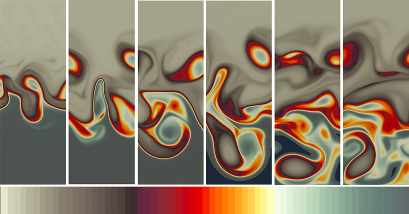
Fig. 4. In a “wave” colormap like this one created by Francesca Samsel, selective saturation is used to isolate and “foreground” specific data ranges so these data are easier to follow over time. In the colormap, desaturated colors surround a saturated section to focus attention while providing context.
Credit: Graphic created by Francesca Samsel with data processed and provided by M. Petersen, LANL, using MPAS-Ocean
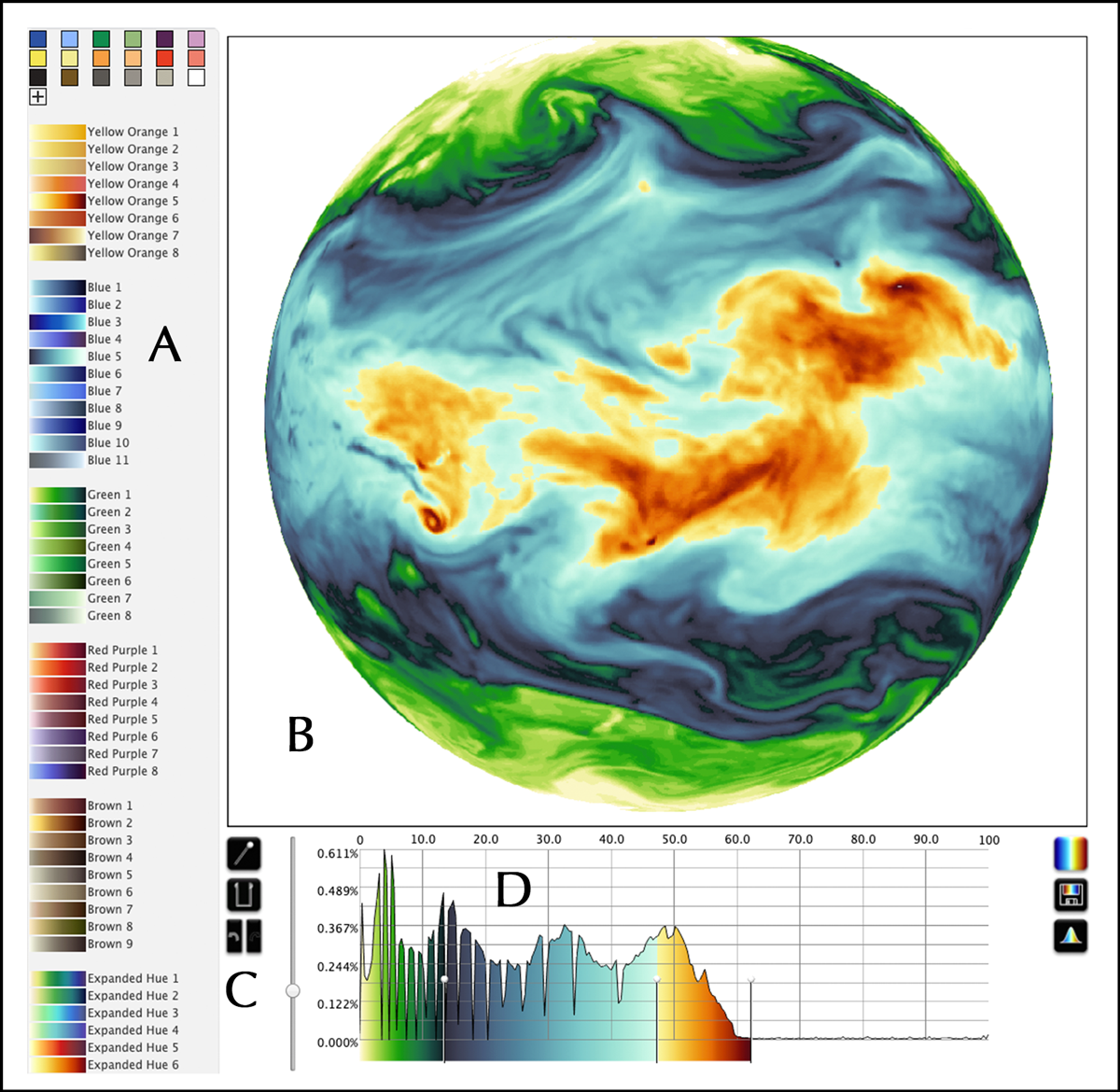
The ColorMoves interface enables users to drop multiple colormaps onto their data and adjust the result interactively, seeing the changes on their data in real time and allocating hue and contrast wherever appropriate (Figure 5). “It wasn’t necessarily intended as a tool for data exploration, but scientists have identified that as a priority” and have been using it for exploration, said Samsel.
Fig. 5. The colormapping tool ColorMoves enables users to drop multiple colormaps onto their data, adjust the resulting image interactively, and see the changes on their data in real time. Within this interface are (a) a selection menu of color scales and discrete colors; (b) a viewing window; (c) controls including a colormap splitting tools, color scale inserter, and undo and redo buttons; and (d) a data distribution histogram.
As part of an effort to optimize colormaps for visualizations, Schloss and her colleagues created a tool called Colorgorical. The tool features a series of adjustable sliders for customizing a palette based on perceptual distance between hues, the differences between hue names, how close together the hues are on the color wheel, and the specificity of hue names (e.g., peacock or sapphire versus blue) [Heer and Stone, 2012]. Users can also select a hue and luminance range within which the custom palette should fall, and they can construct a color palette around a “seed color” (Figure 6).
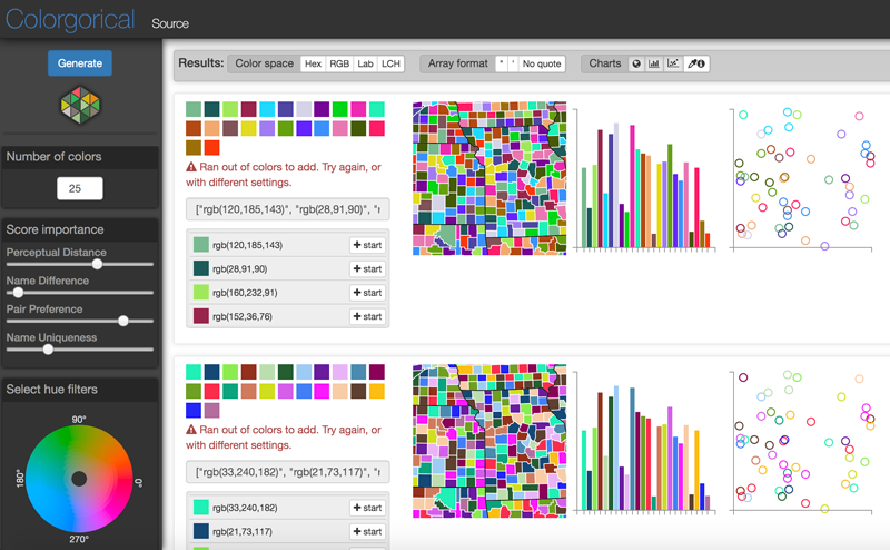
Fig. 6. The online tool Colorgorical allows users to choose the number of discrete colors they need to depict categorical data along with other many other customizations. The tool creates a palette based on the user’s specifications. These palettes can be downloaded or copied in any of the color spaces provided (top).
Schloss, Samsel, and Szafir agree that future research in this area lies in producing automatically generated colormaps that are based on the custom work of designers and that are ready to integrate with the visualization software scientists are already using.
“How can we capture designer practices without asking them to distill their entire field down to an extremely simplified, and therefore incomplete, set of rules?”Szafir and her team at the ATLAS Institute’s Department of Computer Science are already on the path to making this vision a reality. “We started thinking about how to meet the user where they are,” Szafir said.
The attention to detail and creativity that individual designers can offer are unfortunately not very scalable. So Szafir’s team wondered whether they could create a product that was effectively a “designer in a box.” “How can we capture designer practices without asking them to distill their entire field down to an extremely simplified, and therefore incomplete, set of rules?” Szafir asked.
Szafir and her colleagues constructed machine learning models based on 222 expert-designed color gradients and used the results to automatically generate maps that mimic designer practices. The final maps “support accurate and aesthetically pleasing visualizations at least as well as designer [maps] and…outperform conventional mathematical approaches” to colormap automation, Szafir and colleagues wrote in a recent study [Smart et al., 2020].
Despite her team’s progress, complete automation has drawbacks, Szafir said. An algorithm needs a set of data to “train” on—in this context, a batch of colormaps with similar curves in 3-D color space. The algorithm derives a set of rules based on this group of maps, then generates new maps based on those rules. However, “a lot of what comes out of the artistic community that is truly expressive, creative, and engaging comes from breaking these conventions,” she said. “An artist knows where and when and how to break those rules, and we don’t know if we can produce that level of comparable variation [in a program] successfully.”
Both Samsel and Schloss are seeking avenues to merge their diverse expertise with Szafir in the near future, continuing to structure their respective work around the data visualization needs of scientists. “We see a future of using new tools to measure the spatial density of data, creating an automation process that interpolates, aligns, and allocates contrast within a colormap to match [those] data,” said Samsel. Such a program would concentrate variance in hue and luminance where the data are densest, allowing a scientist to visualize nuance and detail where they count.
Conveying an Accurate Message
Scientific visualizations play multiple roles of helping people quantify, interpret, evaluate, and communicate information. Their importance in the exploration and discovery of data is immense and is growing with advances in computational power, yet visualization’s single most effective encoder—color—remains vastly understudied. Although the macroscale effects of such neglect on public perception of issues like climate change are yet unknown, many groups are beginning to devote greater resources to designing their visualizations with the public in mind.
“Data visualization is a language, and, foundationally, you’re trying to tell a story. Color is a huge part of this.”Ed Hawkins, a lead author of the upcoming sixth Intergovernmental Panel on Climate Change (IPCC) report and creator of the now-viral “Warming Stripes” graphic, said the IPCC pays multiple graphic designers to transform complex visualizations into simplified graphics. “We have to be able to reach a very broad audience,” Hawkins added. “Not just for general communication, but also to inform policy decisions and to help people respond to risks that threaten their way of life.” Hawkins and his team spend “a lot of time” focusing on color blindness issues in addition to readability and semantic understanding of color.
Keeping in mind the difference in perception between those publishing reports and those reading them is imperative, according to Lyn Bartram, a professor in the School of Interactive Art and Technology at Simon Fraser University and director of the Vancouver Institute for Visual Analytics. “Rather than engaging people in the experience of understanding big data, we just sort of throw the facts out there and wash our hands of the affair,” she said. “Data visualization is a language, and, foundationally, you’re trying to tell a story. Color is a huge part of this.”
If researchers do not behave as if they are in conversation with their audience, Bartram said, their work will have little impact. “The democratization of data visualization means that it has become media; it is no longer just a means to an end for scientists,” she said. “Visualization has become so much more than just a tool. It is now a part of our conversations and decision-making as a society at large.”
Recommend this post and follow The birth of
modern Man
https://disqus.com/home/forum/lifeofearth/

No comments:
Post a Comment
Stick to the subject, NO religion, or Party politics